What the London Underground Taught Me About Design
The Tube's design principles—from Harry Beck's iconic map to stress-tested wayfinding—offer timeless lessons for digital designers about clarity, consistency, and designing for real human behavior.
The Tube's design principles—from Harry Beck's iconic map to stress-tested wayfinding—offer timeless lessons for digital designers about clarity, consistency, and designing for real human behavior.
I have a confession: I'm obsessed with the London Underground. Not just the trains, not just the stations—but the design. The Tube map. The signage. The wayfinding. Even the typeface.
Some people go to London and come home with photos of Big Ben or Westminster Abbey. I come home with photos of the Underground. To me, it's just as iconic—but for completely different reasons.
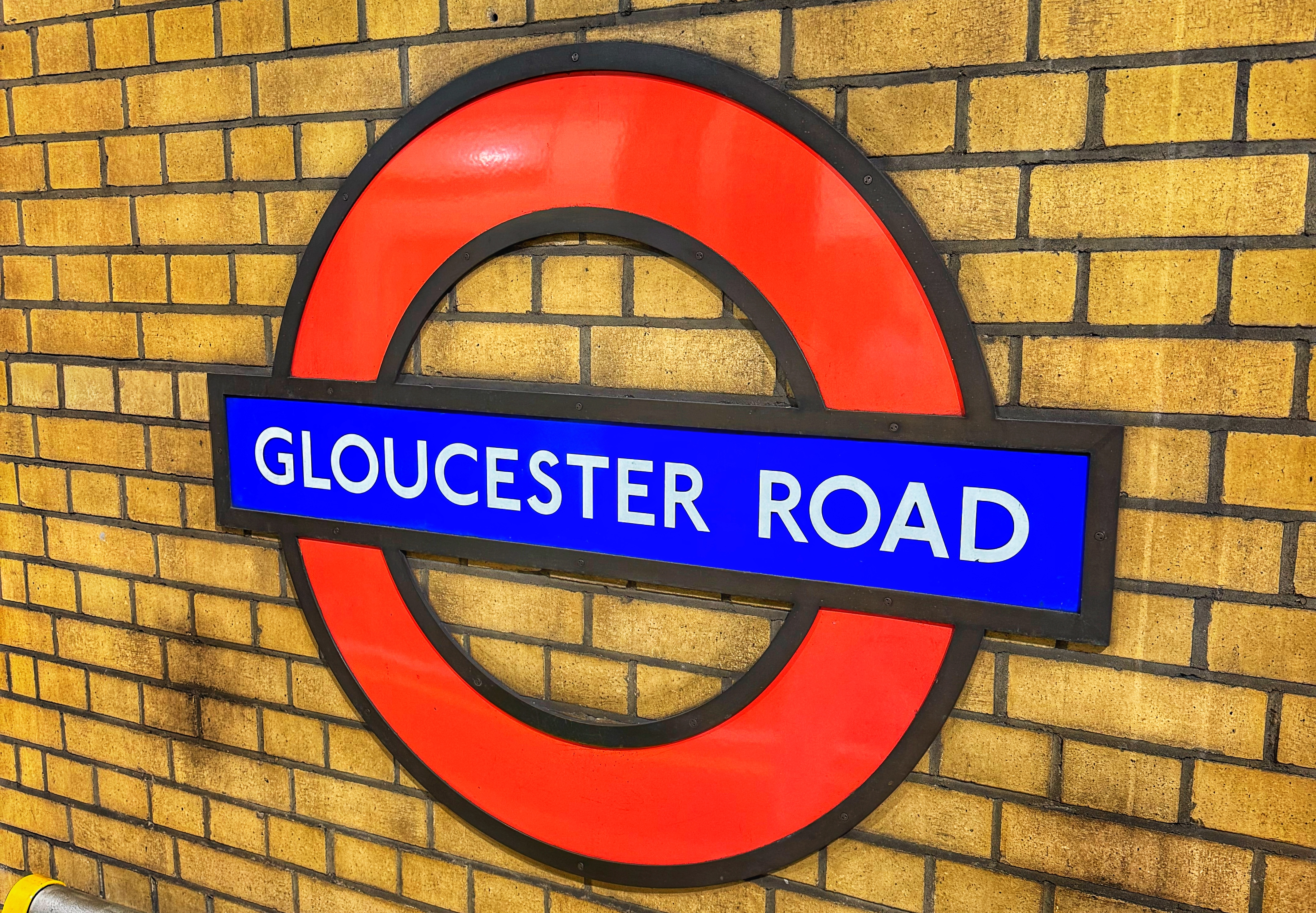
My absolute favorite London Underground station - Gloucester Road.
In 1933, a man named Harry Beck decided to redraw the Tube map. The old versions tried to follow geography too closely, which made it messy and overwhelming. Beck thought: what if people don't actually care about the literal map of London? What if they just care about how to get from Point A to Point B?
So he simplified. He turned tangled train lines into clean, colored paths. He made angles neat and spacing even. It wasn't geographically "accurate," but it was infinitely more useful.
That's the first design lesson: clarity beats accuracy. People don't always need the whole truth—they need the part of the truth that helps them act.
Think about the last time you were rushing through a station: bags in one hand, coffee in the other, trying not to miss a train. The Underground's design was built for that exact moment.
Good design anticipates people at their worst—tired, rushed, distracted—and makes life easier anyway. That applies to apps, websites, even presentations.
The Tube's design principles apply directly to what we do:
The London Underground is proof that design isn't decoration—it's infrastructure. Done right, it disappears into the background and just works.
That's what I strive for in my own work. Not to make something that looks "designed," but to make something people can actually use without thinking about it.
Travel has a way of reminding me that design is everywhere. And when it's done well, it shapes experiences we barely notice—but absolutely rely on.
So yeah, I'm obsessed with the Tube. And maybe you should be too.